Adding a Chart/Graph
- Pete Stapley (Deactivated)
- Bianca Rosa (Deactivated)
- David Engblom
- Karis Hathaway (Deactivated)
Users can also add custom charts/graphs to the Landing Page. To add a chart/graph, click on the Configure button located immediately above the top-right corner of the Landing Page and click Add Custom Widget/Graph.
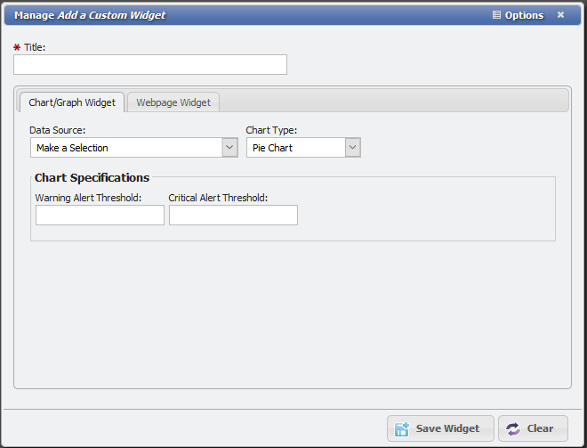
In the form, click on the tab labeled Chart/Graph Widget.
Users are presented with several important data fields. The Data Source drop-down menu – representative of where the chart/graph's data comes from – features key elements of the Service Desk, Inventory, Cable, Billing, and Call Details functions.
Users can choose to build a chart/graph based on specific types of Service Desk items and the deadlines that accompany them, warehouse inventory and its critical re-order points, cabling status in terms of capacity, and a number of other key concerns for PCR-360 users. Each of these custom Widget types is defined on the Custom Widgets Page .
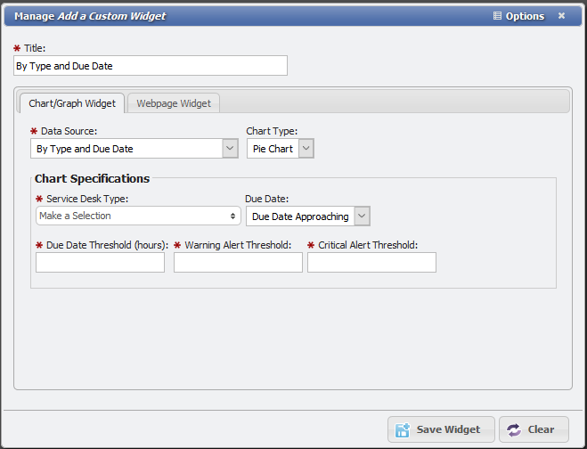
The selection of a 'Data Source' presents the User with a number of new required fields and options. Consider the example displayed in the graphic above. By selecting Service Desk Items By Type and Due Date as the Data Source, the User must define the Service Desk Type, Due Date, and key Threshold notification points in order to build the graph. As is the case in the example shown above, certain 'Data Source' selections limit the available Chart Type selections a User can make.
Thresholds
Thresholds are key components of PCR-360's graphing function. These dictate when a graph or chart warns the User that an important deadline is approaching, be it for a Service Desk item or dwindling inventory in a warehouse.
Users can apply several different types of thresholds to a chart or graph. In the example displayed above, the User is prompted to define three types: the Due Date Threshold which defines which SD items will populate the graph, the Warning Alert Threshold which serves as a mid-level warning or notification via the Dashboard icon, and the Critical Alert Threshold which serves as a serious warning or notification via the Dashboard icon.
A fourth example of a threshold Users might encounter when building a chart or graph is a Reorder Threshold. Like the Due Date Threshold did for SD items, the Reorder Threshold defines which inventory items populate the graph. In other words, if the 'Reorder Threshold' is set at 10, the graph shows only those inventory items that are within 10 units of their specified reorder point for a specified warehouse.
Saving a Chart/Graph
Once all required fields have been satisfied, click Save New at the bottom of the form. The new chart/graph will appear on the Landing Page.
Double-click on any part of any chart or graph on the Landing Page to see a grid of its contents. For example, clicking a specific bar on a bar chart produces a Grid containing only those records in that bar, not those in the entire graph.
Related content
Help Desk Portal - Email: help@pcr.com - Phone: 616.259.9242